Artemys is the ultimate destination for passionate fans of women's professional sports by providing real-time updates, scores, and highlights from their favorite leagues and teams, allowing fans to personalize their experience and connect with other passionate fans.
Professional women’s U.S. sports receive significantly less year-round media coverage compared to men's sports, putting female athletes at a disadvantage and leaving their fans feeling disconnected due to the lack of coverage and access to information.
A mobile application that encourages fans to stay engaged in women’s sports by providing a fully customizable experience and establishing a connection with their favorite United States teams, leagues, and players.
Diving deeper into U.S. women’s sports coverage and what makes up the ideal fan experience, I conducted research and uncovered these statistics:
To prepare for interviews, I determined the key criteria when recruiting participants based on the research conducted. With the focus on women’s professional sports in the United States, the criteria became:

Falls under the demographic of Millennial and adult Gen Z

This study and research is mainly focused on U.S. sports coverage
With the criteria in mind, I recruited and interviewed 3 different people due to availability and time constraints, following this interview guide.
Each participant provided new insights and considerations regarding the problem space.

"It was kind of hard to find other channels to watch live broadcasts, and also big events. Like the World Cup, the Olympics, the marathons it’s very hard to try to find coverage for that."
“I really don't feel like there is much representation. If you go to ESPN and click on highlights, the clips aren’t necessarily highlight worthy. I think they should just show the coverage.”
“I didn't even know that women's basketball was on. You know if you just Google basketball, women's basketball doesn't even pop up.”
From the interviews, the participants’ pain point, motivations and behaviors when accessing and watching sports broadcasts were identified within an affinity map, broken down into three common themes:


Ultimately the chosen theme became awareness as many of the pain points, behaviors, and motivations tied back to that idea. This theme and insight seemed like the best approach for the presented objectives and for a possible digital solution.
As a result of the interview insights, a bit of a pivot was needed considering all of the participants were not very concerned with year-round coverage regarding women’s sports and more so with being aware of events and broadcasts. Resulting in the new question,

From the interviews and new how might we question, I developed a persona of a potential user.

Further stepping into her shoes, I began to understand her experience as it stands now and where I can implement improvements with an experience map.

With the persona in mind, I developed user stories relating to what someone like Jessica would want out of a product to accomplish her goal.
Crafting 30 user stories, I broke them down into key epics tied into functions the product could perform. Considering the user’s main pain points and the overall theme of awareness, I chose an epic and a key user story:

I want to pick which women's teams I receive information about so that I can receive the information I want about the leagues I'm interested in.
I want to discover what women's leagues I can gain more information about so that I am aware of what leagues and teams exist.
As personalization appeared to be the intended users’ most impactful feature, I designed a task flow for the onboarding process that allowed the user to modify their experience using Artemys to fit their interests.

To fully develop the task flow, I first began ideation sketches based off of UI inspiration from apps like ESPN, CBS Sports, and The Score, then moved into developing the first round of mid-fidelity wireframes.


With the mid-fidelity wireframes, I conducted 2 rounds of user testing with 5 people in each round. Due to time constraints and availability, not all of the testers fit the demographic of identifying as a sports fan.
The testers were given 5 tasks to complete with the overall goal of creating an account and personalizing their dashboard. The results from the each round were used to influence the following round of wireframes.
“Should I be dragging and dropping my choices?”
“I haven’t heard of a lot of the leagues before so I’m not familiar with the acronyms and I may not know their logos right away.”
Some testers expressed confusion with the functionality of the selection screens with the layout of the favorites bar. Others also were unsure of the league acronyms and felt they would not be familiar with the logos. So, I updated the favorites bar to have solid strokes as opposed to dotted lines and including sports icons for the leagues.
There were also some cosmetic edits made to prepare for alternate color injections in the future.


“It’s not very clear to see when I’ve added a team to my favorites after adding leagues.”
Switching from league selection to team selection, some testers felt they would like to see a clear difference when favorites were added from the teams vs the leagues. I ultimately created a second, smaller row of sports icons representing the selected leagues above a favorite teams bar.


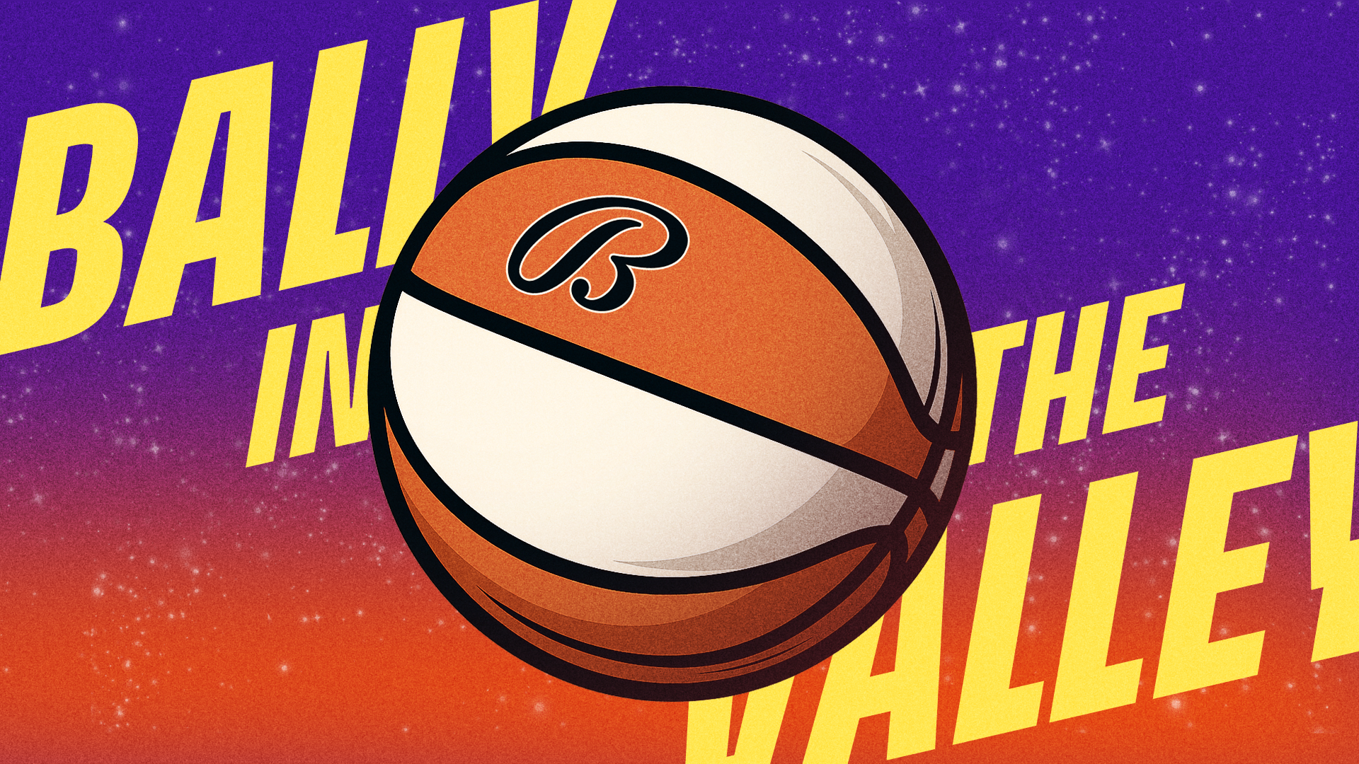
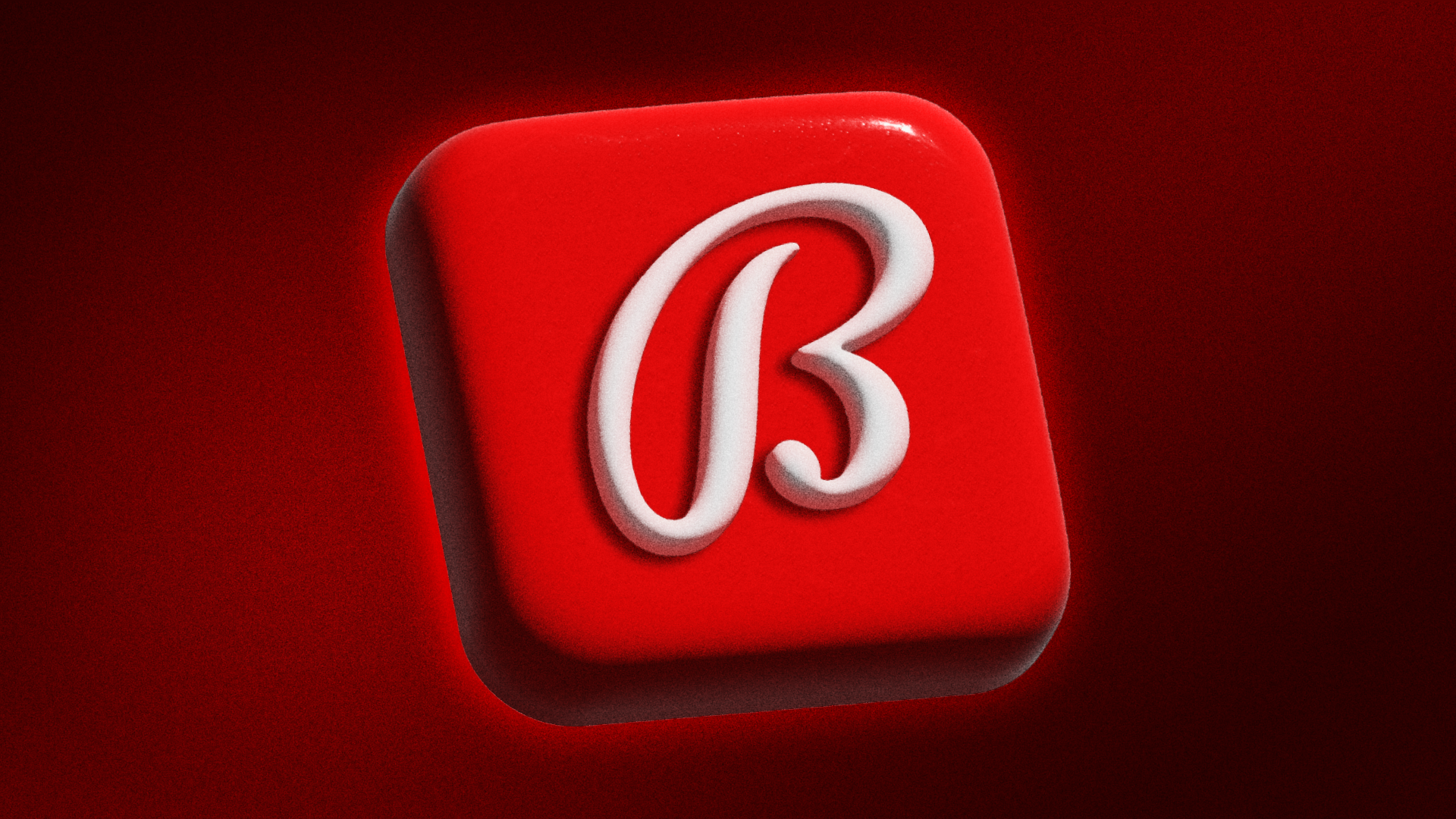
Following the user testing and iterations, I was able to move forward with developing Artemys’ brand identity. Here is a short recap of the main elements.

Brand colors defined, I tried different iterations of color in the wireframes and looked at competitor products for inspiration, such as ESPN, Bleacher Report, and The Score. The main challenge lied in considering the multiple colors of the team logos and avoiding overwhelming the user.

With the brand determined and the color injection complete, I developed a marketing site for the app in order to reach a wider audience and advertise the product. Creating both desktop and mobile, I kept responsiveness in mind and how the content would shift depending on the user's view.

A prototype does not mean Artemys stops here. To continue growing and expanding on the project, I considered some next steps to keep Artemys' journey going.


Nothing is as you’d expect, which is a good thing. It causes us to reevaluate our own bias and enforce the idea to step out of our own shoes. The user is always at the center of every decision in this process and our assumptions will be tested and proven wrong.
Always be ready to pivot. You won’t get the answers you’re hoping for all the time and to best accommodate your intended market, you will have to pivot and reevaluate the problem space also refining the how might we question.
Testing is incredibly helpful and is very important to do early in the process as well as at every step where possible. It helps to catch any confusing elements of the user flow and the design itself, saving time and avoiding having to complete full redesigns.